SMACK GUM
CHALLENGE
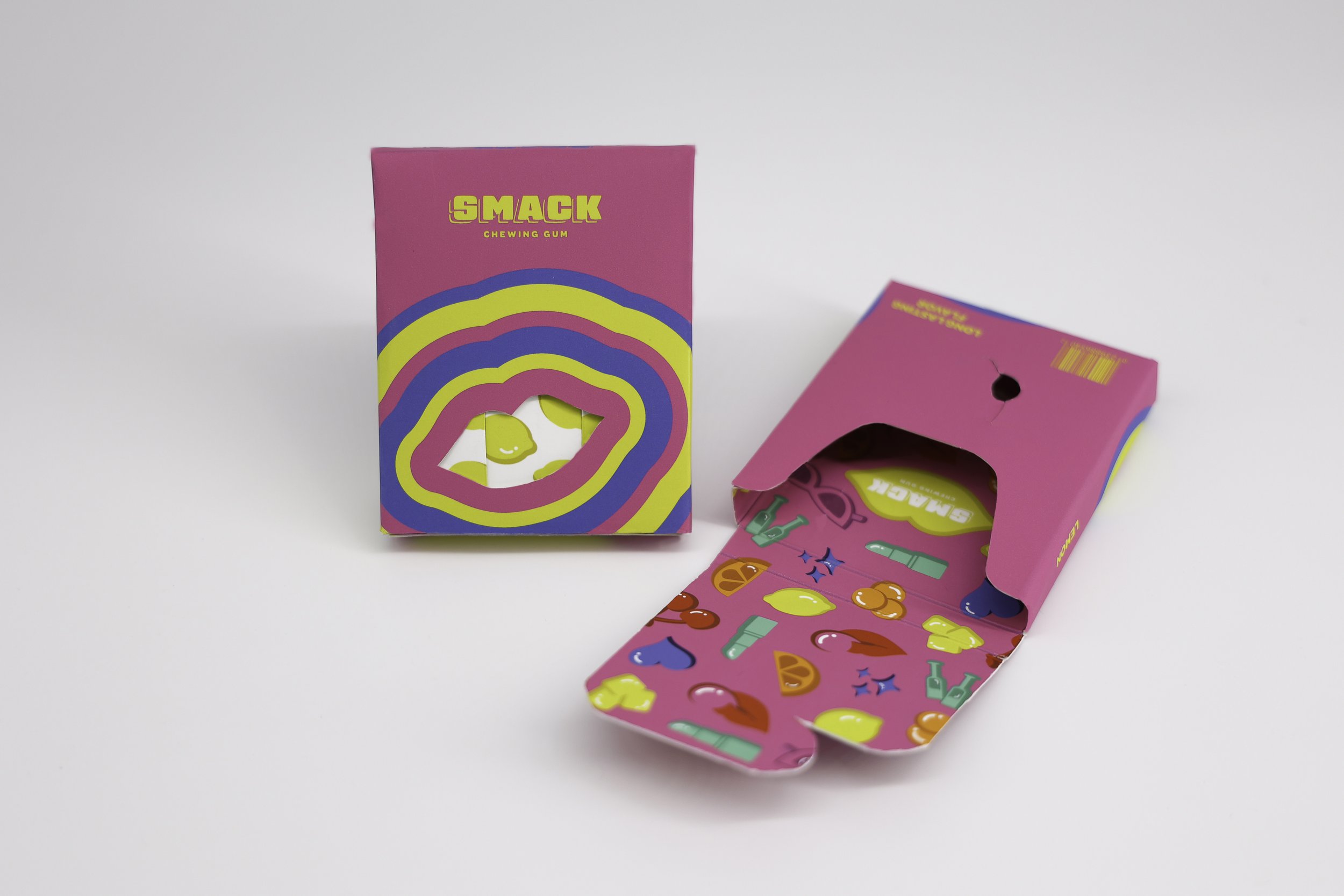
The Smack project aimed to build an identity and packaging for a vibrant chewing gum brand.
APPROACH
The Smack project sought to create a captivating brand identity and packaging design for a playful chewing gum brand located in the heart of Los Angeles, California. Smack also aims to target a younger and trendier audience. Inspired by the city's chic, trendy vibe, the approach focused on using a vibrant color palette and modern iconography to convey a sense of fun and sass. By merging trendiness with a playful spirit, the aim was to craft a distinctive and memorable brand experience that appeals to gum lovers, making Smack Chewing Gum a standout in the competitive Los Angeles market.
My approach for the logo was to develop a custom typeface that resembles a gum piece/candy. The type is nested in a container in the shape of lips to emphasize the contemporary meaning of “smack”, blowing bubbles in a chic and sassy manner.

BRAND SUMMARY
Sassiness can be comes with blowing blubbles with gum. Smack Chewing Gum seeks to emphasize this chic sass through our trendy style. We seek to create a gum that celebrates sass and a vibrant lifestyle. By chewing Smack you can’t help but smack your gum with all the vibrant flavors held within. Be fashionable by chewing Smack gum!
Our brand is the only chewing gum brand that encourages smacking and sass through our vibrant flavors and trendy style.


